The club is the first step, not the plan.
While we get the first club open, we’re also building the things that have to last: a name people remember, and a model other towns can pick up and use.
Developing the Awesomage brand.
For now our mark is a single red figure: one child, counted. It does the job while we work out what Awesomage should look like for the long run.
So we’re developing the brand properly. We’ve drawn 76 logo concepts in three rounds, from loud and colourful to quiet and refined. None of them is final.
Tap any concept to open its full page: the mark, its colours, and how it looks on real things. Nothing here is final.
All 76 concepts.
Give a thumbs up to the ones you love. The favourites rise to the top.
Latin American craft, colour and light. Papel picado, mola, talavera, a torogoz, crayons and cabins.
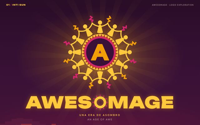
The Andean sun held up by a ring of children dancing hand in hand, every ray a kid.
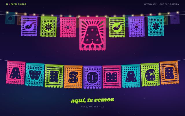
Every letter is a hand-cut fiesta flag, with lace, flowers, suns and birds, strung up to invite you.
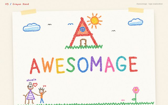
Drawn as an eight-year-old draws home: an A-shaped cabin, a corner sun, nine crayons for nine letters.
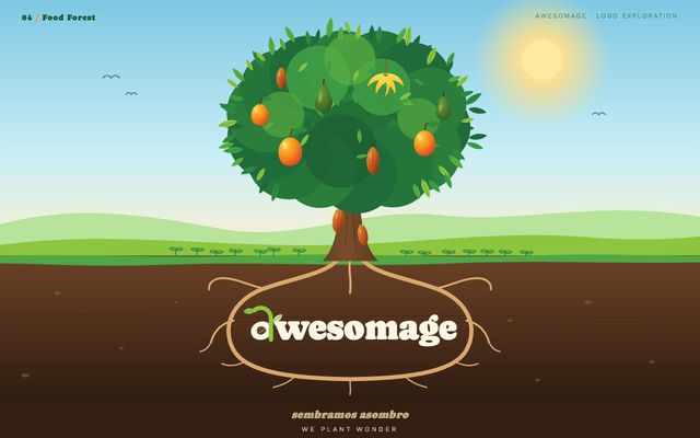
A tree of life that feeds the children beneath it, with the name in its roots.
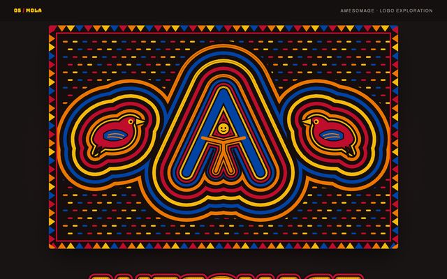
Guna reverse appliqué, cutting through cloth to show colour beneath, with an A that holds a child.
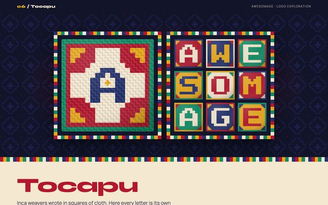
Inca weavers wrote in squares of cloth, so each letter is a woven tile: AWE, SOME, AGE.
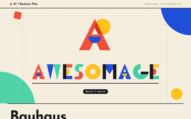
Letters built from the first shapes a child stacks, with an A of triangle, sun and moon.
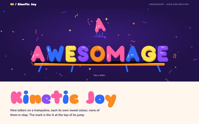
Nine letters on a trampoline, each its own sweet colour, none in step, the A mid-jump.
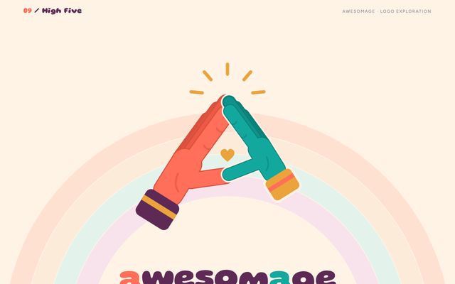
A grown-up hand and a small one meet at the top, making an A with room to spare.
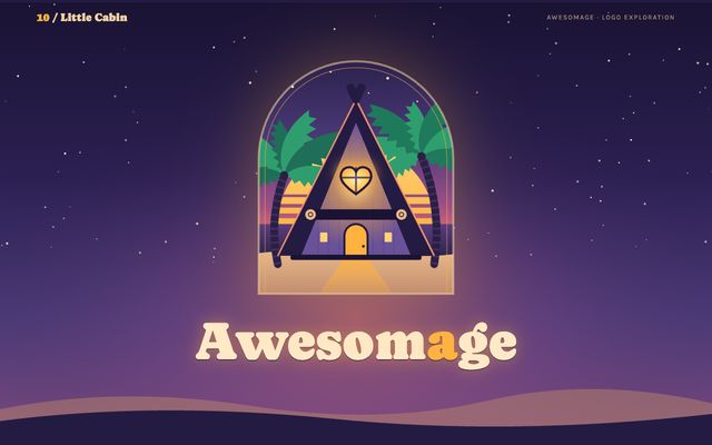
The A is a roof with a lit lamp and a heart-shaped window: someone is home.
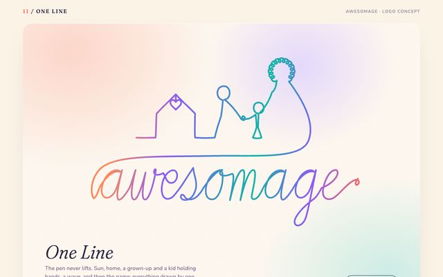
The pen never lifts: sun, home, a grown-up and kid hand in hand, a wave, the name.
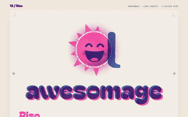
A big sun that is also an a, printed in two risograph inks that never quite line up.
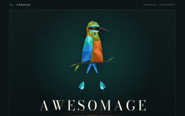
El Salvador's national bird cut in facets like a jewel, its feathers and branch forming an A.
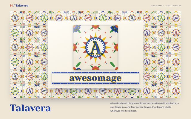
A hand-painted tile for a cabin wall: a cobalt A, a sunflower sun and four corner flowers.
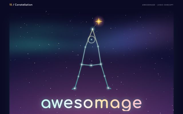
Join the dots and a child appears, arms up, reaching for one gold star, forming the A.
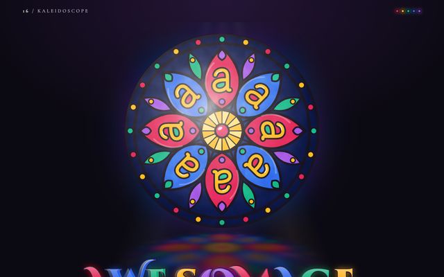
Eight small a's turn around one bright centre, each pane a different colour: many children, one window.
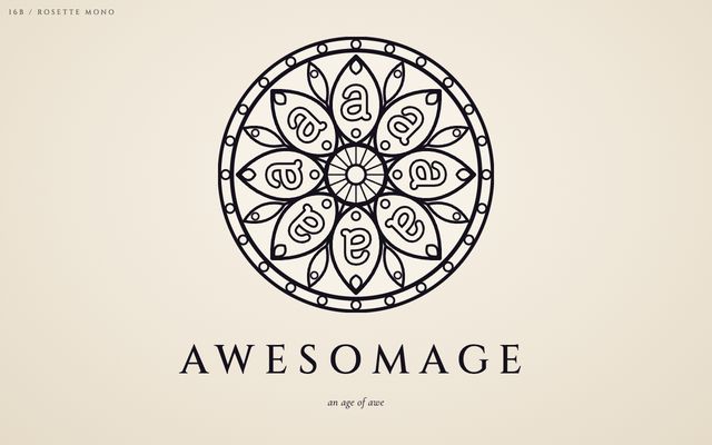
The kaleidoscope with the colour taken out: eight a's turning around one centre, drawn in pure line.
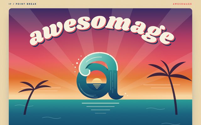
The Pacific curls into a lowercase a, with the sun going down inside the wave.
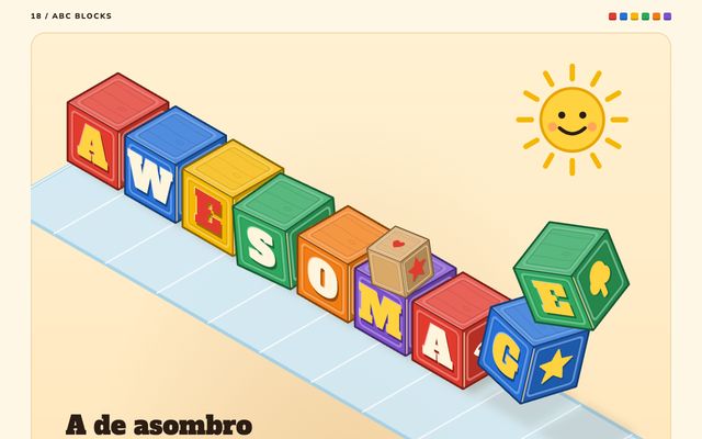
Painted wooden alphabet blocks stacked a little crooked, with A for asombro and the name spelling itself out.
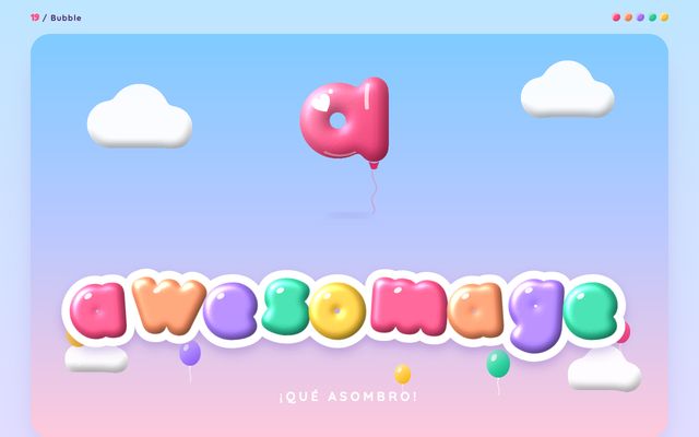
Letters blown up like party balloons, with an a that is a glossy balloon holding a light heart.
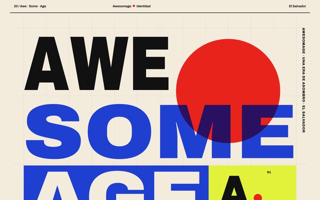
One word read three ways on a Swiss grid: AWE, SOME, AGE, with a red dot sun.
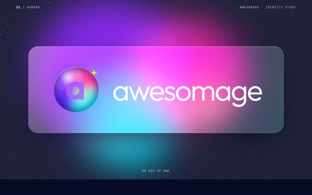
A light that never repeats its shape, with the a as the gap where someone is seen.
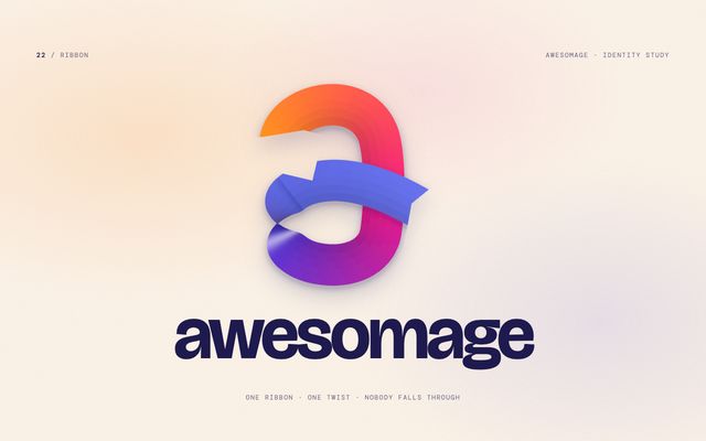
One strip of paper folds through itself to make the a: whoever is inside the loop stays inside.
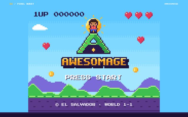
Every kid is the hero of the game: a small player with a backpack on the A.
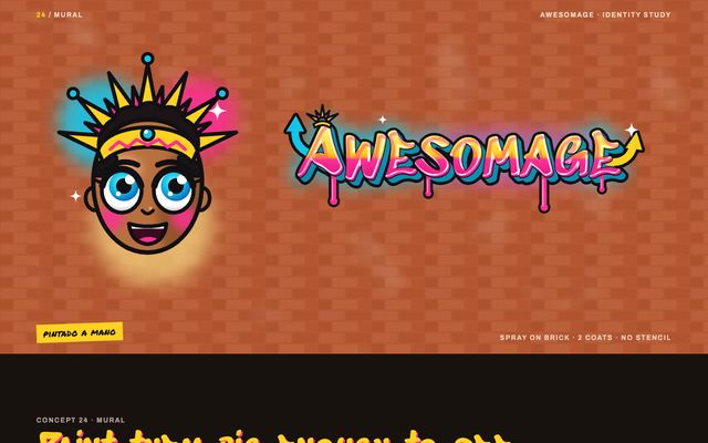
Painted big enough to see: the kids nobody counts get the biggest face on the street.
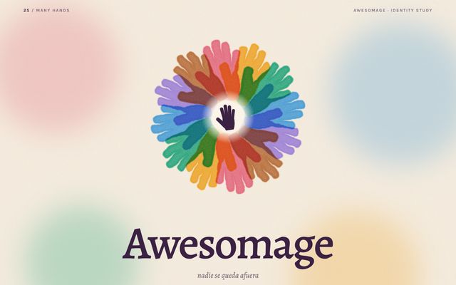
Grandparents, aunts, teachers and neighbours as open hands in a ring, with one small hand in the middle.
Loud and playful. Streetwear labels, record sleeves, game studios, stickers.
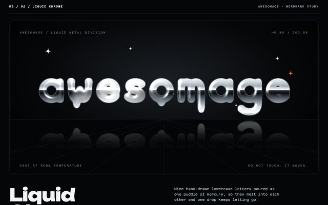
Nine hand-drawn lowercase letters poured as one puddle of mercury, melting together while one drop lets go.
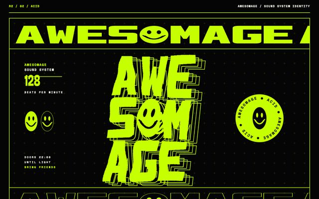
Condensed block letters stacked three by three and slowly melted, with an acid-house smiley for the O.
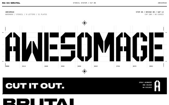
Nine letters built from 21 flat plates, every counter held by a small bridge, in black and white.
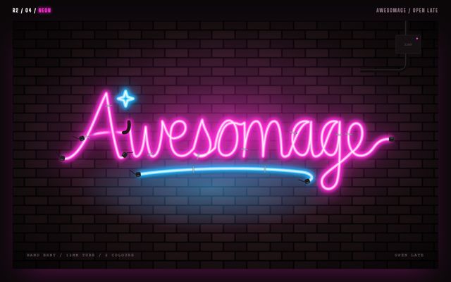
The word written as one continuous hand-bent neon tube, with real electrodes, wall clips and a tired transformer.
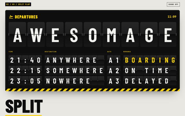
A working departures board where every tile is a real flap, falling until the row spells the word.
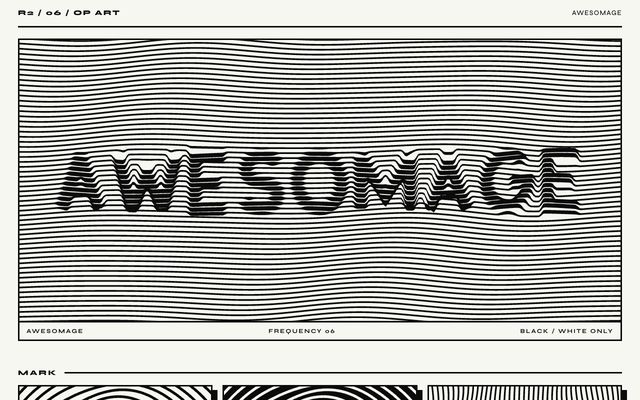
The word is never printed; it lives where the stripes lose their rhythm and slip half a beat.
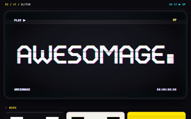
A razor-cut wordmark that loses its signal for a moment, like a worn video tape with misregistered print.
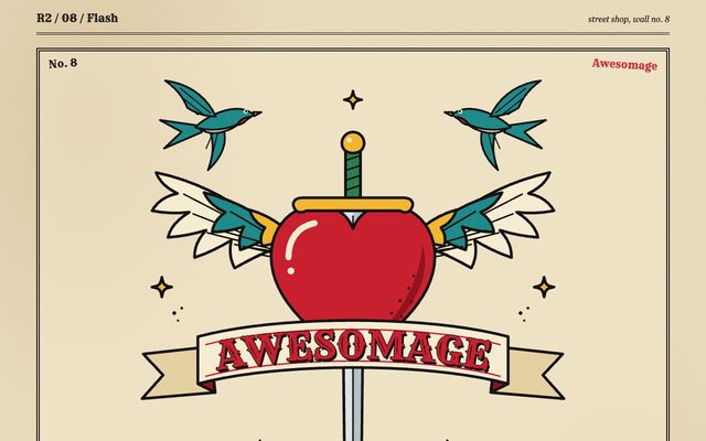
Drawn like designs pinned to a street shop wall: a winged heart, a dagger, a name banner.
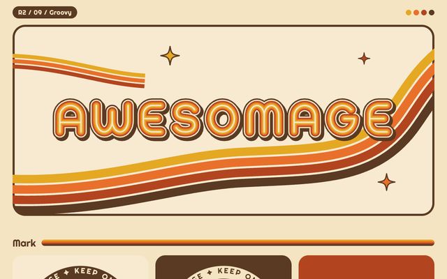
Fat, round letters cut from the same rainbow tape as the stripe on a 1974 camper van.
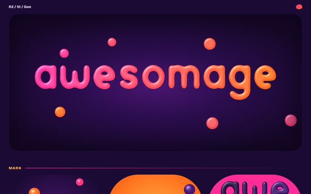
Hot wax drifts, stretches and fuses until, for a few seconds, it spells the name, then melts back.
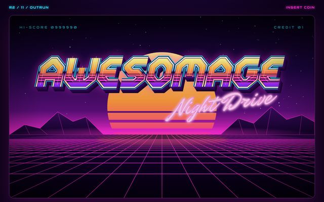
An 80s arcade marquee rebuilt from scratch: angular chrome letters, a sunset poured into them, a laser grid.
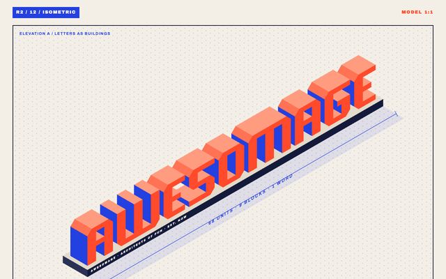
Every letter is a little building, chunky blocks lit from one side like a toy architect's model.
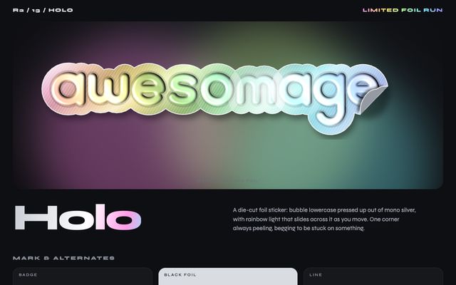
A die-cut foil sticker with bubble lowercase letters in silver and rainbow light that slides as you move.
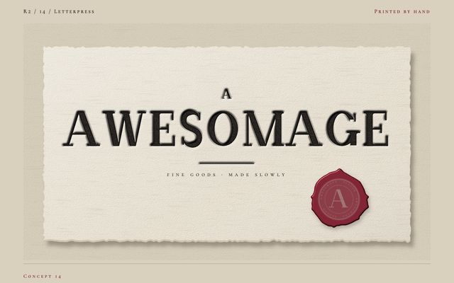
A hand-drawn high-contrast serif pressed deep into cotton stock, with an oxblood seal as the only colour.
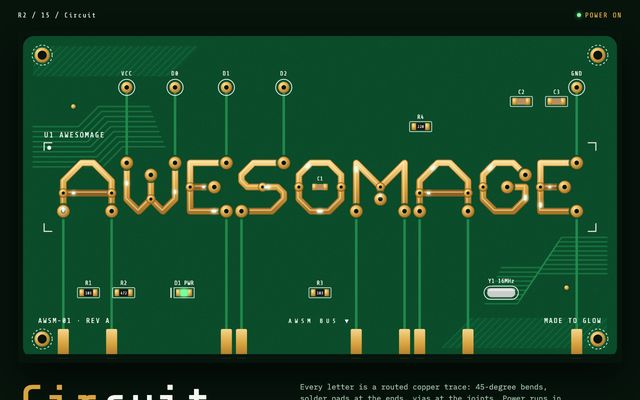
Every letter is a routed copper trace with solder pads, with power running through the word.
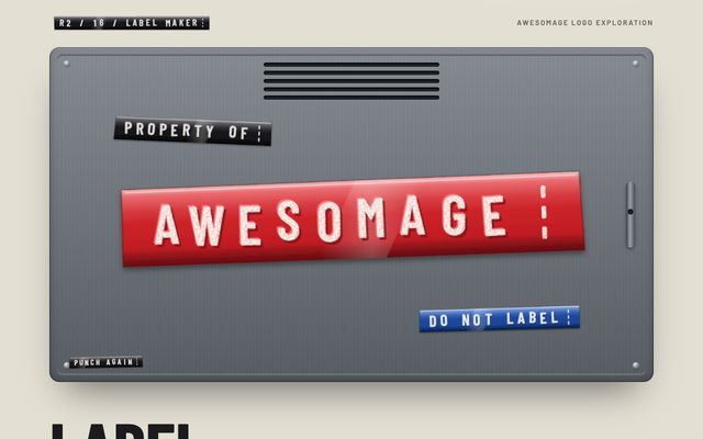
Every letter punched by hand, one click at a time, in raised white, a little crooked.
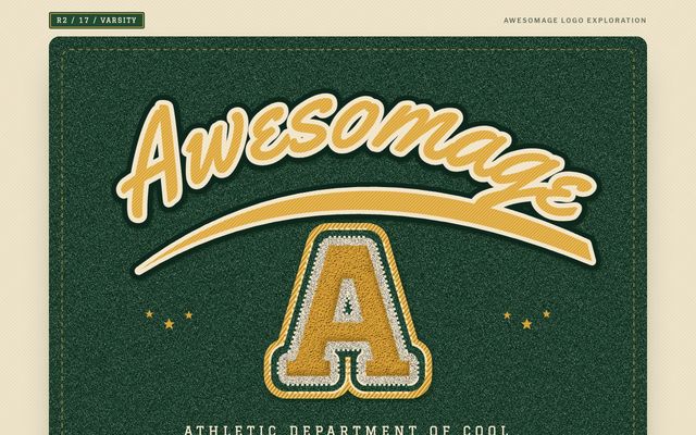
A letter you earn, not buy: gold chenille on pine felt, with satin-stitched edges and a swinging script.
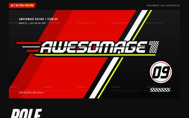
Letters cut from sheet steel and raked forward fourteen degrees, so the name starts at the front.
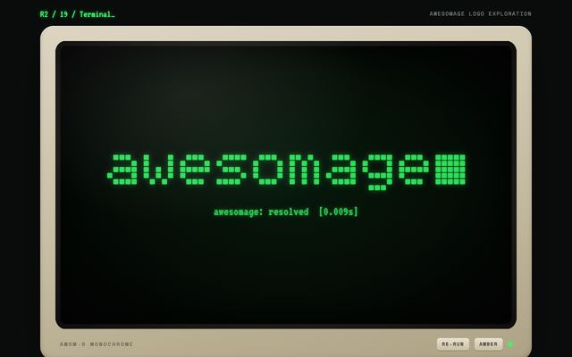
The logo boots up, typing itself in characters, then snaps into a pixel wordmark with a blinking cursor.
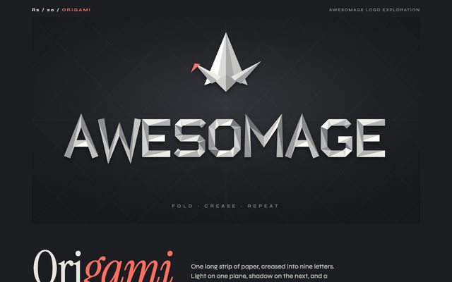
One long strip of paper creased into nine letters, with a single coral fold where the crane bows.
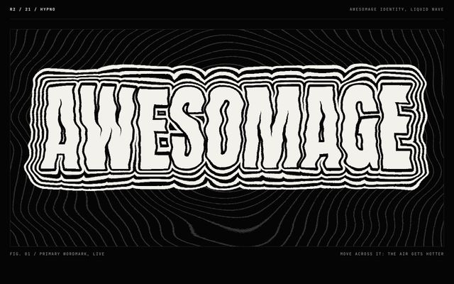
The name as heat haze, each letter radiating contour rings that melt like air over hot tarmac.
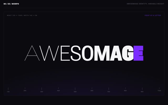
One wordmark with a thousand weights, each letter swelling to ultra black and thinning to a hairline.
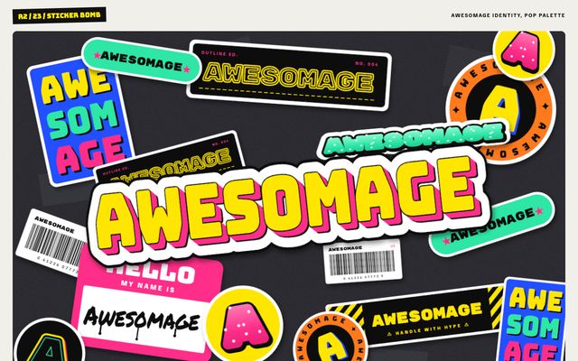
Every version of the name slapped on top of the last, so the logo is the pile.
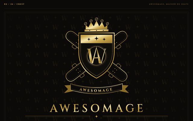
Fashion-house heraldry thrown into the skate bowl, with A and W sharing strokes and crossed decks for swords.
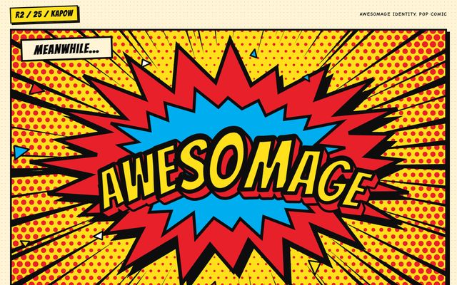
The name as a sound effect that lands on the page, with a starburst, speed lines and halftone.
The grown-up end: restraint, careful letterforms, the calm of a design studio.
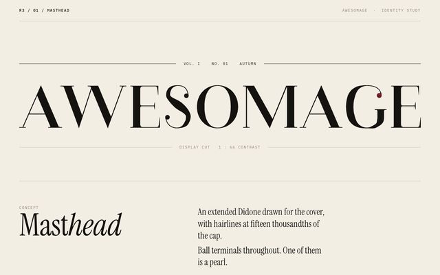
An extended Didone drawn for the cover, with very fine hairlines and ball terminals, one a pearl.
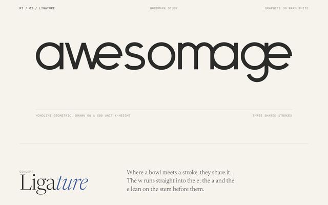
Monoline letters that share strokes where they meet: the w runs into the e, the a leans.
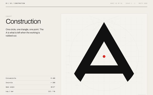
One circle, one triangle, one point: the A is what is left when the working is rubbed out.
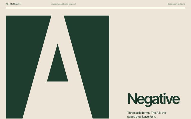
Three solid forms, with the A as the space they leave: its legs, apex and crossbar are gaps.
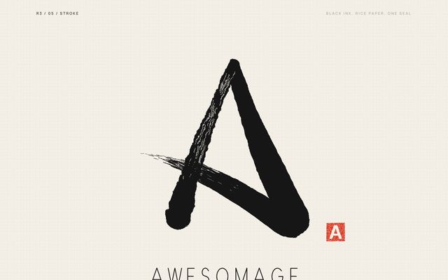
One breath of ink: up, down, and back across for the bar as the brush runs dry.
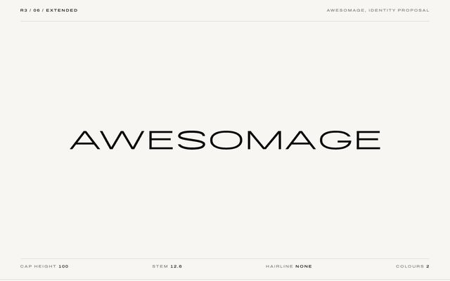
Nine capitals drawn twice as wide as they need to be, in one weight and no ornament.
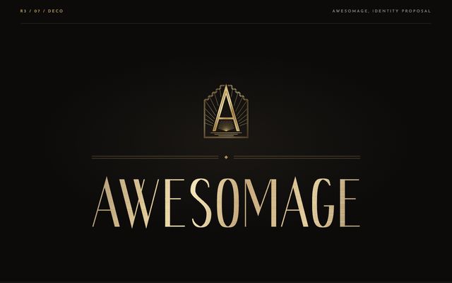
Tall capitals, thick against hairline, like lobby lettering, with an A rising from a stepped sunburst.
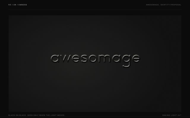
A lowercase wordmark pressed into matte black card with no ink, there for whoever tilts it to light.
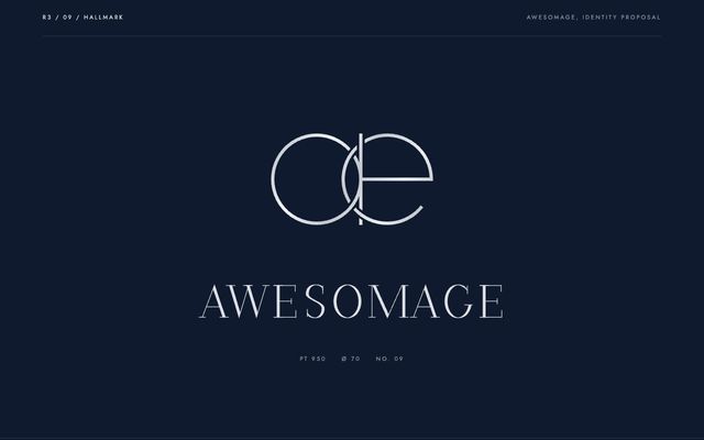
A lowercase a and e drawn as two rings, linked the way a jeweller joins two bands.
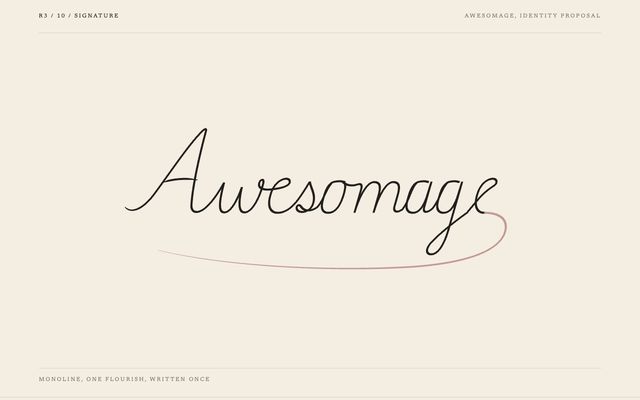
The name written by one steady hand, slanted sixteen degrees, with a single dusty rose flourish.
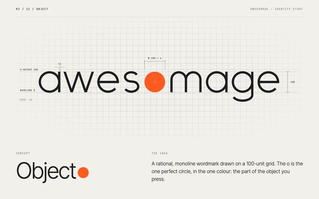
A rational monoline wordmark on a grid, where the o is the one perfect circle you press.
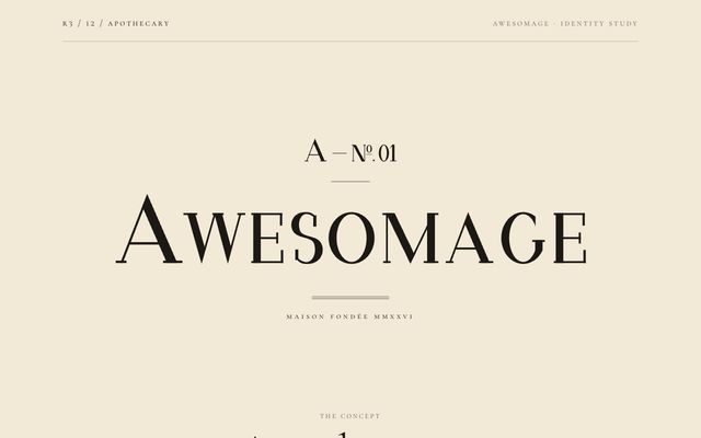
A hand-drawn Didone small-capital wordmark, kerned pair by pair, with a house mark that numbers everything made.
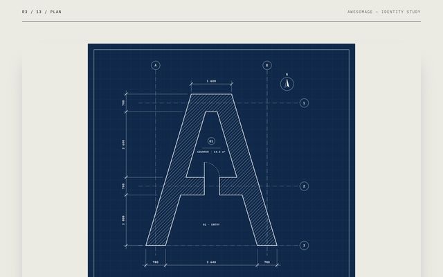
The A drawn as a building, with a door in the crossbar and a room in the counter.
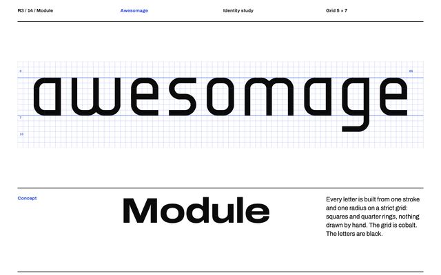
Every letter is built from one stroke and one radius on a strict grid, nothing drawn by hand.
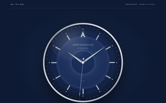
An extended flared capital wordmark on a guilloché dial, with the A as the twelve o'clock index.
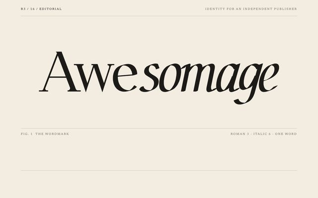
Awe stands upright in roman while somage leans into italic: one word in a book's two voices.
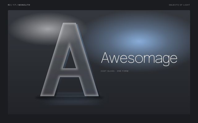
A single A cut as a frosted glass monolith that bends whatever stands behind it.
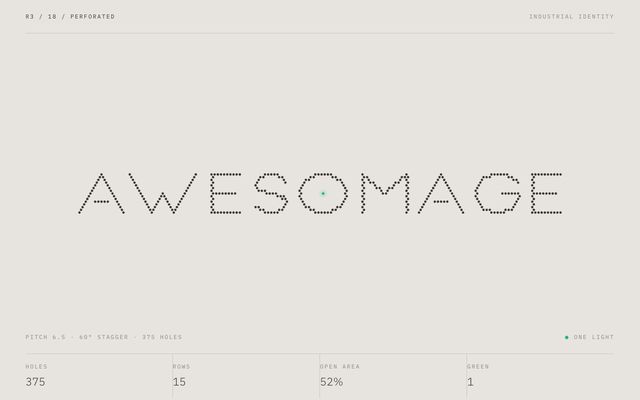
Nine capitals cut from one perforation lattice, with one hole lit like a status light.
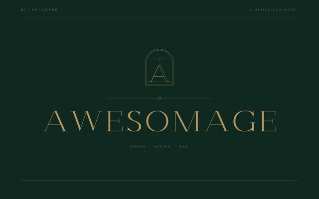
Wide small capitals in a stem and a hairline, spaced like brass hotel lettering, with a doorway-like crest.
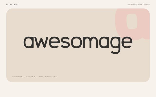
Rounded shapes, a small fillet in every join, nothing sharp, the a worn smooth like a pebble.
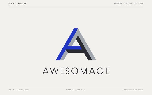
An A drawn from three bars that cannot meet the way they appear to.
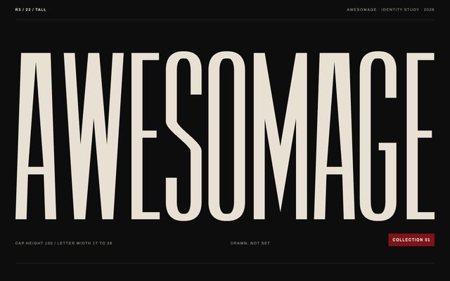
Nine letters pulled upward until they read like a row of stitches, with one cut of red.
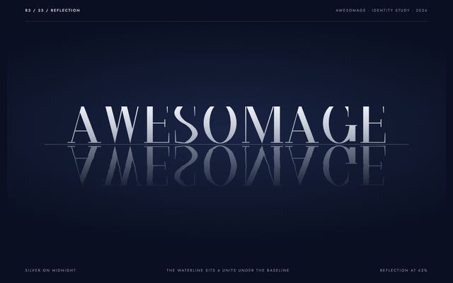
A high-contrast roman with fine hairlines that repeats itself below the waterline, then lets the water move.
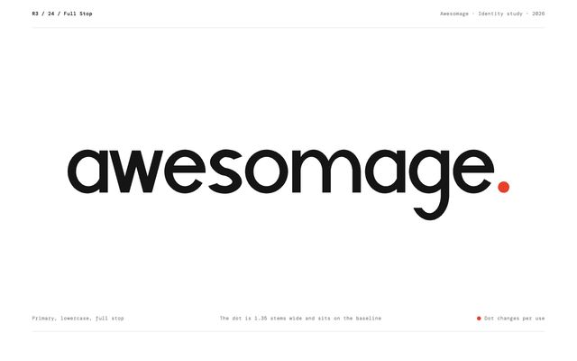
Nine round, heavy letters and a full stop that settles it, in the colour of what it signs.
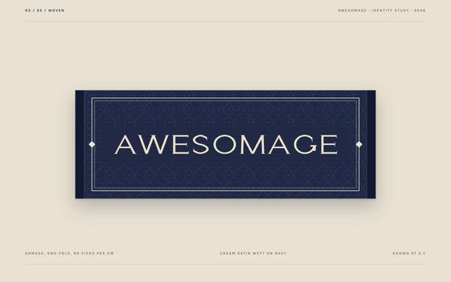
Wide engraved capitals with fine spurs, drawn to survive the loom: a logo found inside a collar.